Wednesday, August 27, 2014

SHADOW OF THE RAVEN


  I love a good historical mystery and this series I've doing covers for by the author, Tessa Harris, have been providing me with great subject matter to illustrate.
The first book, The Anatomist's Apprentice, established the look and has done very well in sales. I conjured up Sherlock Holmes and Charles Dickens for that cover, which has the doctor walking through iron gates into the murky London streets on some mission of skulduggery.
  This latest book, Shadow Of The Raven, takes place in a different period, the 18th century, but continues the use of a scientist / crime solver, using his wits and whatever scientific tools that were available at the time.
  I was given direction that the hero was to be seen carrying a lantern in a tunnel of trees. Turns out, there are several tunnels of trees, mostly in Britain. I chose an ancient yew tree tunnel, much altered  and added an abandoned mansion on the far side of it. For a mansion to be abandoned in the 1700s, it would have to be considerably older, so I chose to create a ruin from the Elizabethan era.
  Many layers of thought and design went into making this image, one of which was the overall book design, with accompanying type. The book was intended for the "trade" market, which has a bigger face with different proportions and usually a more sophisticated, literary look. Through trial and error and also frequently checking out my first cover for design, I managed to work out a dramatic image that lets the reader into the story, as opposed to bashing him or her over the head with a more obvious illustration.
The main character, a doctor, is seen investigating a dark and gloomy tree tunnel, with something no doubt horrible to be discovered in those forgotten barrels...

                          SHADOW OF THE RAVEN


Please leave your comments!

Tuesday, June 07, 2011

INCOGNITO

It's been a while since I posted anything and I'm sorry about that. I'm in the midst of a move and a house sale. Some people can do this stuff as easily as walking a dog, but for me it's a nightmare. However, Art must go on!  Here's a cover for a book called Incognito, by Gregory Murphy, published by Berkley Books.  I don't know whether this cover is being used for the book or not. It is the second complete piece of art I did for this title, the first one was more of a romantic look, then the concept changed on me. This happens sometimes when a publisher is trying to place the book in the prefect niche and isn't sure how to appeal to that group of readers. I know very little about the story, except that it is a mystery that takes place in 1912 in New York City. I did tons of research for this image and learned, among other things, that the famous NY Public Library Lions were put there in 1912, the building was finished a year earlier. I love this era, and enjoyed looking at the familiar 5th Avenue in early photographs. It was just as busy as now, but with a different mix of traffic; carriages, double-decker open buses and all kinds of fancy motorcars. And the costumes! Men dressed in suits, whether they were laborers or bankers, but you can easily see in the photographs which is which, particularly from the hats. The rich had shiny beaver top hats or bowlers and the rest of the men showed their social status by how beat up their hats were, as well as the baggy knees of their pants. The women favored long, tight skirts that must have been very hard to walk in, jackets with fur, if they could afford it and then the hats. This was the era of some of the most outrageous hats ever created. Some were like good sized lampshades, with chiffon and flowers piled on top. That was the shillouette, Skinny body all the way up with a gigantic headpiece.
My wonderful costume person, Sharon Spiak came to the shoot with a genuine period skirt and jacket. The hat was her own creation, but fits the style perfectly. This was my first time working with Linda Holm a beautiful actress from Denmark. She very quickly caught the feeling I was after, in the body language and facial expression. I wanted her to look like she was up to something, sneaking somewhere, but also nervous and excited. The most difficult part of this image was getting the right look and feeling for the Library. I wanted to show more of period NYC, but it was impossible to get that across, without distracting from her. I worked from pictures I took in November last year. The pictures were daylight and it wasn't raining, but that's what artists are for. One little bit of trivia: The trees in front of the library were planted around the same time the lions were placed there and the were pretty small trees. But I needed the atmosphere that the bare branches would give to the scene, so I cheated and used large trees. All my efforts may be in vain, however, if the cover isn't used!
Please leave your comments!

Sunday, April 03, 2011

THE BED & THE BACHELOR

Please leave your comments!

 These images are the front and stepback covers to Tracy Anne Warren's, The Bed & The Bachelor, Avon Books. I'm quite happy about the way they came out and it was a fortuitous combination of ideas and people at the right time, that made it possible.  For a long time I've been playing with the idea of these romance illustrations being about something more than just a blatantly sexual way of selling books. Instead, I've been thinking about the deeper feeling we have in love and romance, feelings that can suddenly become the most important things in the world. That moment, where everything disappears but the object of your passion, is what I'm trying to get across.
I helps so much when you have an art director, like Tom Egner at Avon, who understands art and design and just as importantly, knows when to leave an image alone. That willingness to stand up to the forces of committee blandness is partly responsible for the existence of this image. And so are the models, Suzanne Fogarty and Anthony ...., Who put real emotion into their acting. Shirley Green, my friend and photographer and her assistant, Philippa Clayton, all were part of creating these covers. 
As I was working on these, I began to have strange flashes of the famous painting by Delacroix of the Storming of the Bastile, during the French Revolution, in which a bare-breasted woman carrying the tri-color banner over the top of the melee, amidst smoke and mayhem. So I guess there's a feeling of heroism in the face of danger, or maybe it's more like the couple is saying, " This is all that matters!"...
here's a picture of that painting:
Is heroism sexy? Well, in her case it is.  Can sexiness be heroic?  It's interesting how, after the fact, revolutions seem heroic, but at the time, they are nasty, vicious and brutal. There are heroes, people who did the right thing in an important way, or who went all-out for the common good, disregarding their own safety. But only the winning side gets to celebrate them.  This painting, done years after the revolution, looks a lot like pictures that came out of Cairo recently. On their faces is power, excitement and something that says, "This is all that matters!"

Friday, February 18, 2011

WINTER

What a Winter we've been having here in the Northeast. I have gotten unused to Winter since my move to Florida several years ago, where temperatures in the 50s send people scurrying for their down jackets. But this Winter I've been in New York State, in the Hudson Valley, where we've had record amounts of snow. This image was created for my series, Forces Of Nature, about 2 years ago while in in Florida, but I called upon my many years of living in cold environments to help me imagine the dance of the Winter goddess. I guess that's what she is, reveling in her frosty medium. I originally conceived of the piece as a view looking over her shoulder as she hovered and brought frigid Winter conditions to a little town below. It never seemed to work. Then I played with the idea of her as a dancing figure, maybe even joyful. I used Heidi Bailey as my model, with Shirley Green as the photographer, Sharon Spiak for costume. My home team!
Please leave your comments!

Sunday, January 23, 2011

MY WICKED MARQUESS

This is the front and inside cover for the book, My Wicked Marquess, by Gaelen Foley, published by Avon Books. From the beginning, I wanted this image to have a look of "dark passion", a kind of desperate intensity that sex can have. But how to get that across? The art director had requested they be in an interior, so I started playing with different interiors in my sketches. I decided an empty mansion or chateau would be better that a furnished room, hinting that they are there illicitly, but also that for them, only they exist. I liked the curving stair and it gave me the idea to have the models form a similar twist, at least on the front cover. The models, Harmon and Suzanne Fogarty, caught the concept perfectly during the shoot. By happy accident , on some of the shots, Harmons face was slightly shadowed and I decided to go with that and really make his face in shadow, bringing out the girl in light. I think there is something in the finished image, the spooky stair, the desperate intensity of their bodies, that successfully expresses my original concept.
For the inside cover, I had to invent a bed for them, not a real bed, but more a pile of blankets and stuff the threw together in the empty mansion. Again, I played with shadows, bringing darkness over their legs, to emphasize their faces and upper bodies. Suzanne and Harmon made this one sexy and graceful at the same time. Thanks to them and to Shirley Green, photographer and Sharon Spiak, costumer.
Please leave your comments!

Thursday, December 02, 2010

SOMEWHERE ALONG THE WAY

I am often called upon to do Christmas covers throughout the year. This one was done in  sunny Florida, but I have a large reservoir of snow knowledge to call on from living in the North! This cover for the book, Somewhere Along The Way by Jodi Thomas, started with a photograph by Jim Begley, www.wowphotoshdr.com. He's a talented photographer from Kentucky, who allowed me to use the picture he took of the local Mayor's house in Corbin KY.  I changed a lot about the setting and of course, translated it in my own way. I may use it as a Christmas card, if I ever get around to writing any! Many thanks to Jim for his lovely house picture.
Please leave your comments!

Thursday, October 07, 2010

BOOKS VS KINDLE

There's been a lot of discussion going on lately amongst my colleagues and with art directors about the future of books and specifically, book covers. Most of us were raised in households filled with books and we grew up loving them. Nothing nicer on a rainy afternoon than curling up with a good book, that kind of thing... So we don't quite know what the younger generations are thinking about books. Do they have the same attachment to the traditional medium? And what about the covers? Will Kindle books not need them? At the moment Kindle is still in black and white, but other devices now come with color, so our covers can be displayed.  But you have to decide to look at the cover, instead of it being there throughout the reading experience. I enjoy having a beautiful cover, asking to be picked up and read. Another question is how are the books going to be sold, if the cover is only digital? Will there be full color displays in the bookstores? Will there even be bookstores? So many people have told me they respond to beautiful covers by picking up the book, greatly increasing the chances they'll buy it. I do the same thing.
One of my favorite things to do in Sarasota on a Sunday was to go into the Sarasota News and Books on Main Street. You got great coffee or cappuccino and croissants, all while perusing the latest books chosen by a very knowledgeable buyer. Sadly, like so many bookstores around the country, this place closed early this year.
Which brings me to the question, how do you pick out books? Do you read reviews? Are you a browser, who likes to pick up the books and read a bit?  Do you latch onto one author and read everything he or she writes? How  does the cover influence you? What do you think about ebooks?
Please leave your comments!

Wednesday, October 06, 2010

WHEN BEAUTY TAMED THE BEAST (A KISS AT MIDNIGHT)


This is a two part cover for the book, When Beauty Tamed The Beast, by Eloisa James, previously known by its working title, A Kiss At Midnight,  Published by Avon Books. The theme is vaguely reminiscent of The Beauty And The Beast, but my illustrations imply that the beast is a statue of a lion, which perhaps contains the handsome prince. Ms. James has been doing a series of Fairy Tale inspired romances, a previous one was Cinderella and they are continuing. I think it's rather cool, and it gives me a chance to play with the fantasy side of romance.  From the start, I was heavily influenced by the 1960s film, La Belle et Le Bette, by Jean Cocteau, a masterpiece of film making that is infused with an incredible atmosphere of magic. Unlike the dumbed-down version of the story that Disney offered up, Cocteau dives into the psychology of the story, exploring the deeper meanings in the myth, with profound results. In my image I tried to stick with the feeling of longing in the girl, alone embracing her stone lion. Why is she there at midnight? who is she waiting for, or is she dreaming it all? The second scene doesn't answer much, she could still be dreaming. But the dream has it's happy ending.
Models were Steven Muzzenegro and Bonnie. Photography was by Shirley Green and costumes by Sharon Spiak. Thanks again, team!
Please leave your comments!

Wednesday, July 14, 2010

MOVE HEAVEN AND EARTH

This image was done for the cover of Move Heaven & Earth, by Christina Dodd. My model was the truly beautiful and talented actress,  Ewa Da Cruz. I wanted to get across the stormy determination hinted at by the title and I think the portrait here captures that kind of personality. I liked giving this a true Regency look, but with a twist from the historical portraits of the period, in that she is looking away. That is a distinctly modern approach and creates a feeling of being there as an observer. When I create a book cover, there is only one chance to get across the story. One image. Many different approaches to that problem have been tried over the ages, including incidental clues that help imply a context, having multiple scenes from the story meld together like movie stills fading into each other. But my favorite way is to let the eyes tell the story. The eyes and the body language. The stormy background helps support what we are seeing in her lovely and quite powerful expression
Please leave your comments!

Friday, July 09, 2010

SEVEN NIGHTS TO FOREVER

Seven Nights To Forever, by Evangeline Collins, Berkley Books. I created this cover fairly recently, but wanted to wait for the book to be published before it was posted. I have always enjoyed using pattern in my work, both for galleries and for illustrations. I don't always get the chance, so whenever possible I go for it. My interest in working with pattern goes way back my early days as an artist, experimenting with ways of reconciling realism and abstraction. I wanted them to coexist.  Often pattern gets incorporated into my work as an intentionally flat passage, that forces the eye to look at the whole composition in a different way than if it were a simple rendering of the "real" scene.  My use of pattern has been evolving though, and often finds itself worked into the real space of the image as if it were something actually in the picture, like in this case.  Here, the pattern looks as if it is some kind of fabric on the bed, as opposed to floating above the picture, as in many of my pictures. In another post, I'll show an example of that kind of image.
Please leave your comments!

Wednesday, June 16, 2010

RELEASE FROM PRISON

Ok, I was wrong, there were six illustrations, not five!  This is the last of the Reader's Digest paintings I did for Rosalind Laker's Venetian Mask. I don't remember exactly how it occurred, but the heroine's husband was taken to prison on some charge, no doubt the work of the evil villain. Our lady bails him out and basically saves him, too. Talk about heroic! I had him in his cell, writing a letter ( to his wife, no doubt), when she arrives and the door is flung open. I tried to make it look like he jumped up so fast that he knocked over his chair and spilled the ink. Being one of the upper class, he would have had a chair and table, perhaps, and writing instruments, unless he was really in trouble. I based this cell on a jail cell I remembered seeing in the Doge's palace, near the Bridge of Sighs. For those who aren't familiar with Venetian history,  there was a slot in the wall of the palace through which accusations could be slipped anonymously. To be accused, was to be found guilty. It was up to you and your family to prove otherwise. A system that was all too easy to abuse and a great way to get rid of an enemy or a rival. The accused entered the palace for a hearing and sentence over the bridge of sighs, so called because it would be, for so many prisoners, the last view they would ever see of their beloved city.
I'm quite proud of this series and others I did for the Digest. I hope you enjoyed seeing these images that haven't had a viewing in many years.
Please leave your comments!

Tuesday, June 15, 2010

THE RESCUE

Here's our girl being really heroic! Her friend, seen earlier in the bridal gondola, has fallen out of favor with the evil husband . He has been keeping her in a kind of dungeon, without food. Somehow she manages to bluff her way into the palazzo and finds her friend in a terribly weakened state. Then the husband comes home. Smart thinking, to bring a pistol along!
 This is one illustration where I built a miniature cardboard and wood set, to help me envision the space the actors would be in. I had to know what angle to place the guy so that he would appear to be coming down the high stairs. In the studio we had him up on a ladder and the camera was almost on the ground. You really have to plan ahead to shoot this many scenes in 2 hours. I think this is one of my favorites of the series, because of the strong angles in the composition and because of the powerful body language of the heroine.
Please leave your comments!

Monday, June 14, 2010

THE DUEL

Honestly, I forget who is dueling whom in this scene. I think one is the mean husband and the other, the nice guy our heroine ends up marrying. The duelers are both wearing Bauta masks, but have removed the outer clothing and hats, to have more freedom to move. I placed them in one of those small squares that you find throughout Venice. Little alleys lead off in all directions and you can get very lost quickly. A crowd of party goers stand around watching the entertainment. Dueling was illegal, but with everyone masked,  they could get away with it.
On my wanderings in Venice I had the feeling of ghosts around me in those quieter areas, especially at night. History isn't dead there but lives on and there is a sinister undertone to the city and its history. Rivalries, hidden intrigues, plots and murders abounded amongst the debauchery of Venetian society. Ms. Laker really caught that feeling in her story. Of note is the black Bauta at the left, with the lower part fringed with black lace. It's a very disconcerting look, at the least! It's always disturbing to talk with a person wearing a mask. The seem to take on a strange power that an ordinary face wouldn't have. Perhaps because it defeats our ability to read that face.
Please leave your comments!

Sunday, June 13, 2010

VENITIAN MASK- THE BRIDAL BARGE

As promised, I'm continuing to post illustrations I painted for Rosalind Laker's book, Venetian Mask, as published by Reader's Digest in 1993. This scene shows the heroine's best friend on her wedding day procession by gondola. She is visibly unhappy, because this is a forced marriage, due to economic circumstances and the guy she's marrying is known to be a real creep, but very wealthy and powerful. I wanted to give the viewpoint from gondola height, to direct the eye. The miserable bride is the focus of attention even though she is off to the right. In the printed book, this image was spread across the top of two pages with text below. Venice was still fresh in my mind from an earlier trip and I was excited to be able to place this scene in the Grand Canal. Did I take liberties with the architecture? Yes. And of course no bride would allow her wedding dress to drape into that water, which was even dirtier then, but it created such a nice flowing line and helped get across her defeated attitude, I did it anyway. I believe the model used for the bride is Sue Brown. Brigid Hobbie played the family member behind her in the gondola and I may have posed for the guy in front, but I'm not sure. This painting is four feet long, in oil on wood.
Please leave your comments!

Saturday, June 12, 2010

VENETIAN MASK-THE MASK SHOP

This is another of the paintings done for Rosalind Laker's Venetian Mask, published back in 1993 by Reader's Digest. It shows the heroine at work in the shop that creates and sells masks. She is being noticed through the window by her future husband. I imagined this shop to be in the arched arcade that surround Piazza San Marco. All the masks were all carefully researched. One particularly strange one is at the upper right, which is known as the Plague Doctor. I read somewhere that during the plagues that swept Europe in previous centuries, it was believed that breathing bad air was the cause of the disease, so doctors wore these peculiar masks to sort of filter the air before they breathed it in. Can you imagine being deathly ill and visited by a doctor wearing a mask like that? How horrific! The heroine was played by model Brigid Hobbie, I don't remember the guy's name. I was honored when Reader's digest used this image on their Christmas card for that year, the second time they used one of my illustrations for their card. The first one was for a book called Anya, set in Russia in the 19th century which I'll post at another time, if there's any interest. This is an oil painting approximately 32 inches high.  Please leave your comments!

Friday, June 11, 2010

VENETIAN MASK TITLE PAGE

I thought it would be fun and interesting to post a series I did for a story written by Rosalind Laker, called Venetian Mask, which was published in Readers Digest in 1993.These are all oil paintings and they hark back to an earlier era in illustration. The story features a gutsy heroine, a dramatic rescue and tons of wonderful period detail to help the reader feel immersed in the time. I had been in Venice eight years earlier and had taken the photograph of the great piazza at night. Of course the people in Comedia Del Arte costumes weren't there. One of the wonderful things about working on an historical project is to learn about things I didn't know about before, such as the characters of the Comedia del Arte, a very early form of street theater, which dates back I think to before the Rennaisance. I learned that people regularly went out at night wearing masks and this allowed them to behave in ways they couldn't normally act if people knew who they were. The lower classes could sometimes infiltrate the high society if they were good actors and vice versa.  The masks themselves were very specific and not just random disguises. The oldest and most common type, the Bauta, is shown here on the second from right figure. It was always worn with the lacy mantle, tri-corner hat  and long, concealing cloak. To me it looks very skull-like and creepy. In this scene, four of the main characters meet in Piazza San Marco at the beginning of Carnivale. They are all dressed as specific Comedia characters, I think the woman on the left is Harlequina, I don't recall what the man is and the other woman is Columbina. This story also takes place at the time of Vivaldi and is really the high point of Venetian culture. This, being the title page, was spread across two pages, with some type over it. I'm going to be posting all five of the illustrations from this story over the next few days. A note about the process of creating this series. As usual, I did sketches and then hired models and costumes. Because I was paying for all that, I wanted to keep the costs affordable, so I used only four models! I'm in some of the scenes, too. The other thing of interest is that I set up all the scenes and shot them in Black & white film in just two hours at Bob Osonitsch studio in New York. The prevailing thinking was, these are paintings and the photos are just reference help. Things are different now. I hope you enjoy a look back at these vintage images.
Please leave your comments!
Thursday, June 10, 2010

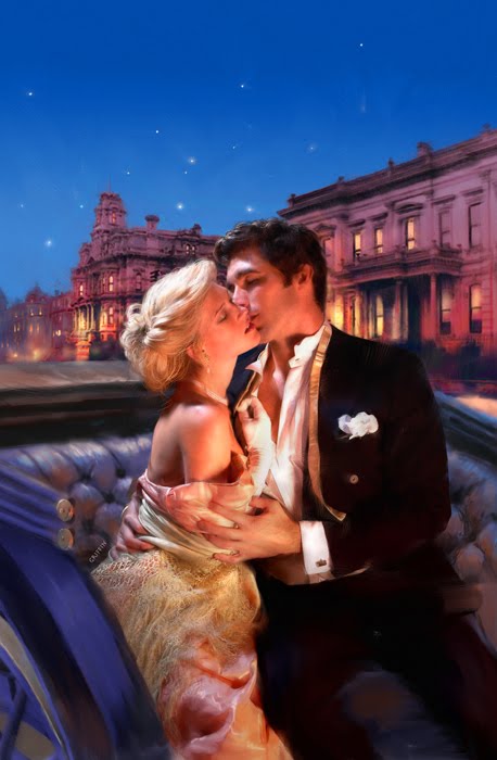
THE SUBSTITUTE BRIDE

Here's a piece I did for a book called The Substitute Bride, by Elizabeth Lane. It is set in 1906, a period that hasn't been so popular among romance authors of late. I really like this period, because of the opulence and sophistication in the fashions, architecture and decoration. A very elegant era. The couple has parked for some heavy petting on the street in San Francisco's Beacon Hill area, ( before it was all destroyed by the earthquake! ) Realisticaly, they wouldn't dare do that in the street, under a bright light, but who cares? It makes for a nice picture, with the lighted buildings behind. I emphasized the play between warm and cool colors in the composition. The carriage was created in the 3D program, Cararra because I wanted to have the exact angle and lighting for the couple to look like they are seated in it. My models were Tracy Weller and Harmon ?? (the last name escapes me). Both excellent models. Costumes, as always by Sharon Spiak and photography by my friend, Shirley Green. A word about the use of 3D "props". In the old days, I used to make little models with lighting, in order to help me get the correct angle, light and shadow. I don't claim to be an expert 3D artist, but I do manage to create serviceable props and settings when I need to. It's actually a very interesting way to work. My inspiration for setting up miniature scenes originally came from Maxfield Parrish, who used to build very elaborate miniature scenes, using rocks, mirrors ( for the water), sand, plaster, etc. He apparently had a collection of favorite rocks for this purpose.  Mine were mostly wood and cardboard, sometimes painted. Sometimes I used toy cars or plastic models. Nowdays, 3D has dispensed with all that. Interesting to note, another artist/hero of mine Fortuni, was really into designing theater sets. He would make complete miniature stages, with working parts, lights curtains, everything so he could control the effects on the big stage. There must be something very exciting about working this way for many artists.
Please leave your comments!

Tuesday, March 23, 2010

FALL from The Forces Of Nature series


This oil painting is part of that ongoing series I've been creating over the years. I thought of her as I worked on the painting, as the embodiment of fall and like my previous post, Winter, is commanding and playing with her element, the falling leaves. But there is an air of sadness to her amidst all the beauty. It's a feeling I often associate with fall, a kind of pleasant melancholy. There is still some leftover warmth from summer, but with an undertone of the approaching winter. Fall always seems too short, in my opinion, but so delicious, with ripened apples, a hint of wood smoke in the air, warm sweaters and fall foods. The light changes and days shorten. Perhaps our lady is playing with her leaves one more time before the real chill begins.
I went to New York and photographed a model for this, Ewa da Cruz. She acted the part so beautifully, we didn't want it to stop! Shirley Green was the photographer and Sharon Spiak created the costume.
Please leave your comments!

Thursday, February 25, 2010

WINTER


This is an another in my series of Forces Of Nature, that I've been working on slowly for years. The idea is to embody the particular Force in a woman. It's an ancient tradition, but of course, I give it my own style. In this image, I was imagining the figure of Winter as dancing and delighting in her frigid powers. Earlier versions of this had her looming over a small, snowed in town, but I like it better with just her, playing with the flying snowstorm.
People in much of the world have been seeing plenty of her magic this year!
The model was Heidi Bailey, Shirley Green studio and Sharon Spiak, costume.
Please leave your comments!

Friday, January 29, 2010

A DUKE OF HER OWN

 
The reason I haven't posted in a while is that i've been incredibly busy, creating more covers. This one is for a book by Eloisa James, titled A Duke Of her Own, ( Avon Books). Ms. James seems to be setting her stories in the late 18th century, the Marie Antoinette era, as some like to describe it.This is nice, because it allows me to play with the flow of huge amounts of fabric, that were used in dresses of the period. I doubt very much if we'll be seeing a lot of mens' clothing from this period, because it is so outlandish by today's standards. Men were peacocks in fashion then and it baffles the mind to figure out how they could have a decent sword fight in all that getup. A great movie for this period is Vatel, which tells the story of a party planner for a duke when Louis XIV was coming to visit with his hundreds of courtiers. Vatel, ( Gerard Depardieu ), the man in charge of making it all work from pies to fighting ships to fireworks displays has the job from hell. Watching the movie you get to see what went on behind the scenes in the Sun King's court. But I digress. This cover has been very popular, so I'm showing it here, with the whole art, not the cropped version you see on the book cover. The Duke is really going to town with his lover on the inside cover! The models were Christine Donlon and Paul Marron, the costumes by Sharon Spiak and Photography by Shirley Green. I made the scene on the inside cover in 3D to fit the figures.
Please leave your comments!