Sunday, February 11, 2007

THE MOON


THE MOON, the latest in my series, Forces Of Nature, is so new it's still wet! No one has seen it, so this is a first time viewing for readers of my blog.
I have always felt a close affinity with the Moon, at times feeling like it influences my moods, even things that happen. But mostly, I love the magical quality of moonlight, the light source of choice for Romantics!
This image is the second Moon I've done for the series, and probably won't be the last. For one thing, I want to get closer to the magical aspect and to capture the quality of light it reflects better. That light is a peculiar color, not a warm light, but also not just a blueish light either. It seems to be both at the same time! I went back and forth between the blues and naples yellow while working on this.
About the image itself. I imagined a man alone, but with a full heart, falling in love with the Lady of the Moon. She looks down and seems to see him, above the whole bustling city below. She looks lovingly at him as he shows his longing for her with his outstretched arms. Of course they can never be together, but she will look down on him every month.
There were no models in this one.
I am very curious about how you react to this image. Please feel free to let me know!

Tuesday, January 30, 2007

THE STORY GIRL, #1


This was the first of eight covers done in 2002-3 for a series of books by L.M.Montgomery, author of Anne of Green Gables. The series was called The Story Girl Of Avonela, published by Zondervan. In the story, the main character always wears red clothing and is prone to odd hats. She also tends to be a leader to the gaggle of kids that are her pals, often reading to them, so, to introduce her in this first book I had her sit close to the viewer, apart from the other kids, book in hand. My interest was mainly on the lovely face of Amber, a fresh young model, who has a beautiful, exotic look. She appears on all of the books in the series. I posed her in a position reminiscent of Renaissance figures, this appearence further enhanced by the abundant drapery of her dress. To help give her a plane that was distinct from the background I used a device I've employed before, a flattened plane of overhanging leaves. In this case the sun, shining through them making them glow and gave me an excuse to hit her with areas of intense sunlight. It also alowed me to minimize the detail of the background scene, which is a good thing, because it would have been incredibly hard to paint all that small stuff and would have competed with the main figure. But my favorite reason for using the overhanging leaves is for the graphic effect of forcing the eye back and forth between the flat composition and the spacial illusion of depth. Between a flat pattern and an image you look into. It's a theme I return to constantly!

Wednesday, January 17, 2007

DIVINE BY BLOOD


This image is the cover illustration for PC Cast's latest book in her 'Divine' series, DIVINE BY BLOOD, which is not yet released. This image is meant to show the daughter of the woman in the previous books, who has inherited the divine powers from her mother. I have to give credit where it's due and the design for this image was devised by the art director, Kathleen Oudit, at Luna. She came up with a powerful concept that was exciting to work with. This is really a pleasurable symbiosis, whene the artist and director are so much in sync that ideas flow back and forth freely. Thanks, Kathleen! And thanks, PC, for coming up with a story of such imagery!
Anyone who notices a resemblance in these covers to work by Maxfield Parrish is correct. He was a major influence and we set out to emulate his paintings, but, of course, do it in our own way. One of the ways I keep my art fresh is to continually look to the past for inspiriation. What I love is how an idea becomes transformed as it gets reinterpreted. Cross-cultural and across time, ideas get filtered through the culture we are living in. That's how we end up with crazy and wonderful things like the movie, MOULIN ROUGE. I'm sure Max did the same!

Sunday, January 07, 2007

DAWN


This is an unpublished painting that is actually a predecessor to my Forces Of Nature series. I painted this to try and push the illustration market in a direction I wanted to go. I've tried this many times over the years and it almost never works! Well, not right away. Sometimes it take years for the publishers to decide it's a look they're after. This one never got me any work, and I don't know why.Maybe you all have some thoughts? It was intended to be a woman feeling the pleasure of awakening in this beautiful, somewhat fantastic setting. The comment it received most often was, " she looks lonely! ", not good for selling books, I guess. The publishers of romance interprted the image as if the girl awakened alone, maybe she spent the night alone, maybe nobody loves her!
For inspirationI took my cue from perfume and fashion ads where the woman is often shown alone, just looking beautiful. But I guess I broke one one of the unwritten rules of romance covers at that time.
I learned a lot doing this, just seeing how I could play with light and with the theme of a single girl. I think I was struggling with the realism of the scene, really wanting it to go into the magical realm, but it just teeters on the edge of fantasy. I guess I wasn't readu to push it over!

Tuesday, December 05, 2006

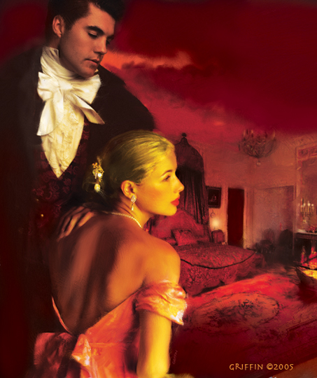
THE COURTESAN'S COURTSHIP


I created this cover last year for a Harlequin Historical by Gail Ranstrom. The idea was to somehow get across that this is a story of intrique and maybe dark deeds, as well as romance. The art director suggested we show the back of the woman's dress open, to suggest she's dressing (or undressing!). I used Maria again, but made her very blonde, and Jason Wright. This is set in the regency period of London,( around 1815), but I think it has more of a Grace Kelly Hollywood look. Whatever, it was a very popular cover! I'm showing you the larger, uncropped image, as it was done for the final art. What the art directors do with my images is pretty much out of my control!
This is a digital image, composed in Photoshop and made much more painterly in Painter. When I work, I try to have the technique enhance the spirit of the book. If this were a modern spy story I think the old fashioned paint look wouldn't be right. But in this case it seemed to fit.

Sunday, October 22, 2006

SAGKAFIOR


I haven't posted for a while, sorry! Things have been a little out of whack recently, probably due to the fact I moved to upstate NY for the Fall. Nice place to be for Fall, but such a big change from tropical Sarasota! I'm finding my moods being strongly affected by the ominous change of Fall into Winter, with it's lessening light and dissappearing foliage. I'm not used to coat-wearing and huddling inside. I lived up here for many years and the same thing happened every time. It's one of those deep, animal things... One of the consequences of the darkening season is that I get more intensely into creative projects. It's a way of fending off depression, I think, but it works! I notice there's an edgier quality to my work, with a more troubled spirit. But that's kind of interesting.
This piece, named Sagkafior, (for no particular reason-I just wanted a mysterious sounding name!), is an experimental piece, not done for a client. I was attempting to tell a story in a more abstract way, hinting at the nefarious goings-on in the story,(if it was a story). I imagined a queen of an alternate world. Beautiful, but evil, she schemes and plays people off each other, while gathering power around her ever tighter. But really, I also just wanted to play with design ideas, so things don't really have to make sense, do they?
This image was built on a shot of a new, ( to me), Egyptian model named Ewa, that Shirley Green photographed and kindly allowed me to play around with the shots. Because no client is waiting for his or her concept to be realized, I can be free to push the envelope. There are so many elements and textures in this that I'll just name a few: the "ribbon" is a doodle I saved and scanned, texture in the upper right is frost on a window, the wheel thing is part of an architectural decoration on a Chicago building.
Ok, now I've taken all the mystery out of the image. But that is partly why I do this blog. To lift the veil of mystery we artists try to maintain around our work. There's an awful lot of B.S. out there concerning how art is created, and I think it's harmful. Art usually doesn't just flow like a faucet out of an artist's fingertips. Most of the time it's thought about, planned, tried and rejected. Ideas are played with and played with some more. I believe most artists only have a vague notion abot where their work is going and that's as it should be. It keeps life interesting. But it also makes for anxiety when you embark on new direction, as I'm always doing. I have reinvented my art so often that it's hard to nail down my style for gallery owners and art directors. My hope is that somehow an essence of whoever I am comes through in all these different styles. At least that's my story and I'm sticking to it!

Thursday, September 28, 2006

THE QUEST


This image wasn't done for a book, but was one of those things I do for pleasure, when I "cut loose". It's just fun to try new ideas out that nobody has to see, - unless it turns out well! And believe me, there a plenty on the cutting room floor, as they say in the movie biz. So I guess I like how this came out. It really started with a face from a shoot I did several years ago. I was having Irina twirl in the wind, wearing dress, a long cloak and a sword! She was playing with different expressions of fierceness and something about this frame struck me as intense and beautiful.
I added lots of hair and started playing with the background, which was a swirly fantasy scape. It didn't work. It got put in a folder,where it sat for maybe three years till I retrieved it. This time I had a better idea of where I wanted it to go, perhaps as a result of something I'd figured out in that time.
That is one of the interesting things about working creatively, ideas evolve. Often an idea is hatched, but the knowledge or experience isn't ther to make it work. The artist, Charles Burchfield went bask to little sketches he'd done 20-30 year earlier and glued them down in the middle of large watecolor paper and just elaborated on the images outside of the small original rectangle. He did some of his best paintings like that. Anyone who is not familiar with his work should have a look.He was a truly unique painter and viataly in touch with nature and with expressing emotion. He also managed to convey sounds in his paintings!
Wow, that was a tangent! All I was trying to say was to hang on to those ideas you have an maybe later you'll know what to do with them!

Friday, September 22, 2006

THE PRICE OF MURDER


Here's another mystery cover, done for a Berkley book of the same title by Bruce Alexander. It is the last of his Sir John Fielding Mysteries, sadly the author has died. I was asked to create an image that looked like a period painting, but gets across the mood and hints at the story. The series is set in Regency times, but involves a young investigator who works for and is the 'eyes' for the blind Sir John. There's a nice mix of views of the better side of London society and the really seamy underbelly of dark streets, danger and shady characters. The story begins with the discovery of a murdered child and that's the scene I was asked to do.
I started by doing a lot of research into early photos of London, but they don't really exist from this early on. Photography really started to be a real device for recording scenes in the 1840s, while this story is set around 1815. there were later pictures of the Thames area, but by then the character had changed quite a bit, so I extrapolated from photos taken a little north of london back in the 1870s which showed smaller buildings and a little more humble waterfront. To these I added a faint St. Paul's on the opposite shore, and populated it with figures and a cart. The figures were all made up, using reference of workers and fishmongers in old photos, with one especially important figure, the fishmonger on the right sadly carrying the bundle containing the dead child.
It's an incredibly gloomy scene! You can almost smell the coal smog. I was worried that the art dierctor would hate it, saying it was too dark and to lighten thisngs up, give it a blue sky,etc. Surprisingly, they went for it, maybe because it conveyed the mood of the story.
I used the horsecart, the most foreground object in the scene, to draw the eye in and then over the diagonal line of the road to the man and his bundle. So, rather than just see a gloomy old painting, the mind is curious. Just what is going on here?

Monday, September 18, 2006

IN THESE DARK HALLS


This one goes way back, to 1986, two years after my Italy trip. I think it is heavily influenced by Carravaggio. I don't remember the real title for this book, but I was doing a bunch of covers for the well known mystery author, Mary Stewart, so it could have been one of hers.
I love doing mysteries, especially when I can get into the pychological state of mind of the protagonist. In this case a young woman in hard times is married to a rich but disturbed Lord who takes her off to meet the folks, a difunctional family unit, if there ever was one! Just when she is getting used to the icy dislike of the in laws, she begins to think her new husband might be trying to kill her! She is snooping around at night, in my picture, trying to find clues, when she hears someone else skulking around,-maybe her murderous husband? I chose to bring the girl right up front so we can see her expression, while she is turning and directing our look to the shadow of an offstage person at the bottom right. It is much more frightening sometimes to just hint at the "monster in the house" than to actually show him.
The Carravaggio influence is in the strong light and shadow on the girl and the contrast between her and the dark background. In an illustration you have to grab the attention of the viewer and make the important action in the story you're telling very clear. Every element in the picture should help direct the eye to that message. But art works best when there is more to it than just the obvious message. We want to read into the image and in this case, the eye keeps coming back to the girl whose expression is somewhat ambiguous. Is she frightened? Determined? Curious? What does her hand express? These are the stories under the Story and help give the image interest.

Tuesday, September 05, 2006

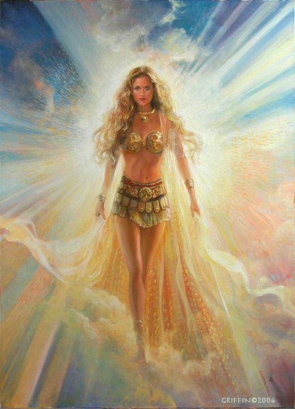
THE SUN


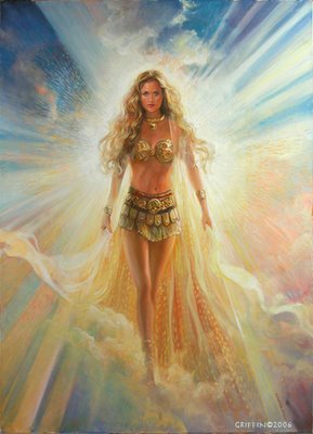
THE SUN, from Forces Of Nature series. This is the latest image in the group, in fact the paint is still wet! This series is not for any book, but is part of an ongoing set of allegorical images I'm doing, using female figures to embody the forces of nature. This is the second attempt at The Sun, the first just didn't feel right. I found the sun to be a very challenging subject, perhaps because it is so important. The painting went through months of changes, sometimes looking to harsh or too warm or too religious, like those paintings in Mexican churches of the Virgin Mary. That wasn't what I wanted. Instead I envisioned a woman, young and powerful, radiant with energy and even sexuality. Yet there is a spiritual quality about the sun, too and I hope I conveyed some of that in this piece.
I set up problems for myself from the start with the lighting. Where was the light coming from? Behind her? To the side? From inside? Each question goes to the essence of what she is and I never really decided, so the light comes from behind her, as if she was bringing it to us, but also from the sides, as if it were wrapping around, in order to keep her from being just a silhouette.
Departing from my usual practice, I didn't use a model, but instead created a woman in Poser. I wasn't happy with the poser girl's face, so I borrowed a face from an earlier shoot, but changed it drastically, adding yards of golden hair and her gold accessories. Her gesture kept troubling me. Was she aggressive, like a warrior? Her gait and body posture sure looked that way.
I tried adding a spear or something to her hand, but it seemed distracting and too warlike. I don't think of the sun that way. In fact, I don't think of the sun in only one way, it is so important, so vast and life-giving, but can also kill with it's heat and intensity. I think this won't be the last version I do of The Sun. Wait 'till you see my rendition of The Moon, as a contrast! It's in the works now.
It's important to note the difficulties and the failures when talking about the process of art. Museums rarely show artists' failures, and they don't show up in books much, but believe me, they exist! The creative process is hard, messy and generally a fight between discouragement and perserverance. A typical project for me starts out with the excitement of potential. This could look cool, or maybe like that! It's all possible. Then my limitations begin to show. I get depressed. "What a lousy artist!", goes the voice in my head. Sometime, often, that voice wins and the image never gets finished, particularly in my personal work.
In Illustration, of course we don't have that luxury.We have to come up with something at least acceptable, if not better! What pressure! But this is also one of the great things about the job. We aren't allowed to give up, so somehow we find a way to get beyond the discouragement and then something begins to work.
My Grandpa told me back when I was just a kid, that the true test of whether a profession is a good choice for you is how much you love of it's drudgery! So much of what goes in to any work of art is like that. Just menial, hard work. Drudgery. But somehow it can be therapeutic, just to clean the brushes, or arrange the computer files. Inspiration comes along to those already working.

Wednesday, August 30, 2006

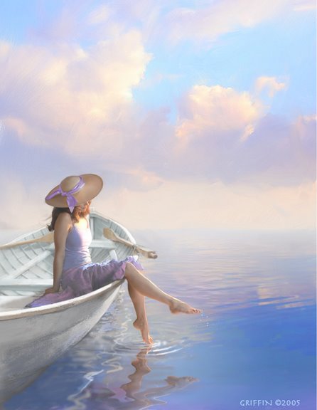
SEA GYPSY


This illustration was done recently for a Fern Micheals novel of the same name. I'm happy with the way it came out, I don't mind saying! It is a digitally painted image and I do mean painted. It was quite a challenge to get the girl looking natural on that boat and to have the water rippling out from her toe, but it was the labor of love. I enjoyed every minute of it! The model is Laura Williams, one of the best and most versatile models arround. She never fails to catch exactly the feeling I'm after and she does it with ease! The was no boat,( totally made up ), or water at the shoot. Laura was perched on a bench, with her legs draped over a sawhorse. More and more lately I'm finding art directors asking me to have the woman turne away, or somehow anonymous. The thinking is that she could be you, the reader,( in a perfect world!). I think they're right. But it's a bit of a shame not to see her lovely face!
Here's a link to Fern Micheals' site: http://www.fernmichaels.com/newsflash.html

Saturday, August 26, 2006

DIVINE PHOTO


Ok, In the interests of being informative and because PC Cast expressed an interest, I'm posting the photo used as reference in her cover, Divine By Choice. To recap the process a bit, I do a sketch, set up a shoot, pick the model, interpret the costume, ( in this case bringing in yards of gauze), specify the lighting, point of view and general pose. In the New York phot studio, the photographer, the costumer and me all run around like mad to achieve this result, wind blowing, fabric being wafted with lots of help, while the model, Maria, becomes the goddess, - all in one hour! In my studio I select the shot from about 90 frames and begin creating my illustration. It's not easy to describe how I do this. It is a bit like collage, mixed with painting, but also something else that the computer bring to it. I have to be mindful of the vision I have, no matter how focussed I get on the details. Back in the days of straight painting, we illustrators used different methods to help keep perspective, like looking at the painting in a mirror, or through a reducing glass, ( which makes the image very small), or even taking the painting outside, where it always looks tiny, pale and weak! But it's helpful to see the image with fresh eyes, to gauge whether it's getting the look we wanted. Nowdays on the computer, I can reduce the image on the screen, flop it, print it, whatever.
With this illustration I wanted to get across her divinity and her relation to the old tree, which I think is a portal to the other world. I wanted the tree to have a spirit, and envelop the girl, but also let her stand out in all her glory. I remember trying various electrical rays and lightning behind her, to show her magical power, but the art director wisely talked me out of it. The tree itself was inspired by several different ancient trees, one being a huge tree called the Angel Oak. It is really out of scale with her. She would have have to be very tiny in the picture or the tree would be just one massive wall of bark. So I just used some limbs from that, the trunk from another tree and the moss from yet another tree, which I then added to. I was trying for the whole scene to look like it was a sacred, ages-old place, and felt it needed a special stone, perhaps created by some long lost culture, to mark the spot. The stones were made in 3d, using Cararra with some wonderful, lichen textures I collected from somewhere and then given the embossed symbol and lots of chips, cracks, encroaching moss, etc. in photoshop. I sound very technical but it actually feels like painting.
It is essential with figurative painting, to get the figure to "inhabit" the space. There are techniques, like making sure the perspectives agree, the lighting and shadows, but also the artist has to"feel" the figure's gravity intuitively. I envision a line of weight, running from the top of her head right down to the soles of her feet. When we stand, our weight is often carried more by one leg than the other. Paying attention to that leg helps visually anchor the person in the scene.

Friday, August 25, 2006

DIVINE BY CHOICE


This cover was done for the second book in the series by P.C.Cast, Luna Books, soon to be released. Maria, the same model from the first cover, portrays a heroine now at home with her divinity. She stands in front of an ancient tree, a portal into the other world where she is a goddess. This was done without having read the book, so I just imagined, based on a spare description, what the scene was like. There's a long-running dispute about how accurate the cover artist should be to the author's story. I've witnessed authors and editors holding up production because an item of clothing was the wrong color, but just as extreme, covers that don't have anything to do with the story inside! Some sort of happy medium is best, where the artist has license to interpret the scene and give it visual excitement, but also is reigned in a bit, so that the illustration really is about the story. The challenge for the artist is to find a way of summing up the scene in an image, without getting lost in slavish worrying about every detail.
It works best for me when I read the story and can visualize the characters, setting and action. I think there is usually a dramatic point in the story that might lend itself to imaging, but the spirit of the book has to be considered. Is it an action-packed adventure,or a thoughtful, poignant love story? These would require very different approaches! That love story might be best hinted at, with a subtle image, like a hand lifting a tea cup, or a beautiful scene that has a poetic connection to the book. The illustrator also should remember his or her image will help sell the book. So in that sense, accuracy to the story is less important than who is the intended reader. I've never liked this part of the creative process, because I think all sorts of people respond to good images. But there is a reality that can't be ignored! Readers picking up a book that has tough guys and explosions on the cover, would be upset to find a gentle story about a woman finding her true love, nor would the reader be happy who picks up a book showing laces, flowers and sunshine, only to find a book about monstrous flesh-eating aliens!
Why I don't like to pigeon-hole the intended reader too much, is because these conventions become stale very quickly. You can see this phenomenon in book stores, where all the books in a certain genre take on a look that is incredibly similar. They all are using the same symbols. Adirondack chairs are big right now. Check it out!

Sunday, August 13, 2006

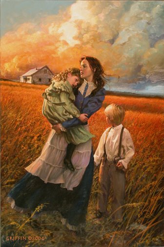
A GRATEFUL HARVEST, Prairie River Series


This oil painting was done for the second book in the Prairie River series,by Kristianna Gregory. All four books of this series used the same central character and I used the same model as that lead character. Luckily, because these were spaced over a few years, the character in the book was maturing right along with my model, Kelly Lynch! From the first book to the last, she had tremendous ability in acting a role outside herself. She showed a lot of spirit, especialy in the first shoot as a 13 year old alone in a studio of adults, lght and camera pointed at her and the photographer and myself calling out directions.
I was after an heroic look to the scene, the young girl/school teacher toughing it out on the prairie. I wanted a sense of urgency, conveyed by the look on her face and the kid's poses, but also in almost every element in the picture.
I believe that everything in an illustration should support the story or feeling you're trying to convey. If it doesn't, it's a distraction.

Wednesday, August 02, 2006

Captive Dreams


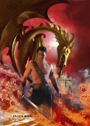
This is a recent cover for Berkley and I'm afraid I don't know the author. I'll try to find out. Fantasy starring sexy alpha males came up in the discussion on Michele Hauf's Blog,(http://dustedbywhimsy.blogspot.com/). So here's my contribution to the genre. By the way, the dragon is supposed to look like it is made out of metal, like a broach, or something like that. I found it hard not to make it into a real, living creature. To do this image I had to train my eyes to see the guy the way a woman would. I asked myself, " What does a woman find sexy in a man? " All my experience indicates it's not the way he looks as much as the kind of person he is. Strong, decisive, but listens to his woman. He's independent, but devoted to her, and because he's magical, he can take her away from her mundane life! And of course he wants her body passionately! Is that about right? No wonder guys feel intimidated by the romantic ideal! Both sexes constantly do battle with the ideal and the real.
We might be strong, but we don't know how to listen, or we're good listeners, but can't whisk anyone anywhere! Do women read these books and then turn and look at their mates with dissapointment?

Friday, July 28, 2006

DIVINE BY MISTAKE


This digital painting was a cover illustration for the first of 2 books for Luna by P.C.Cast. The second is called, Divine By Choice. I enjoyed creating this image, even though tons of work went into it. Another opportunity for fantasy and a goddess! Most of the work went into creating the dias she stands on. It was made entirely in 3d. The horse heads were made in Poser and imported into Cararra, where they were flattened and attached to the steps previously made to form a frieze. The other motif used on the step fronts was made in tiny parts, assembled and stuck on the steps. The bronze incense burners were also created in Cararra. I applied and refined the stne and bronze textures in Cararra, too. The rendering from all this was brought into photoshop, where I added the background, running horses and grass. All this before the shoot. Actually, I made a girl figure to stand on the dias in Poser, to help the art director and photographer visualize thow it would look. On the day before the shoot I found an area of wild grass growing by the roadside and cut a large pile of it. My wife, Tabita gathered it into a tight bundle and braided some strands for a rope and we trimmed the bottom flat. I bought about 6 yards of flowing white cloth and lugged it all in to the studio for the shoot.
I had worked before with Maria, a tall, voluptuous Russian model, and she seemed right for this part. Sharon Spiak, costume designer, dressed her and Shirley Green, Photographer, set up lights and a platform to match my sketch and we were off!
The shoot was like a ballet, with various participants. I believe all the work plus my enthusiasm helped everyone get into the spitrit. This wasn't an ordinary, everyday shoot. We all knew we were creating art!
I don't want to forget another key ingredient in this process, the art director. I had the priviledge in this series of working with one of the best, Kathleen Oudit. It is not an exaggeration to say in many ways she was a co-artist on these two. We often work closely, inspiring each other with flashes of imagination. It is a rare pleasure to work with her !
As you can probably tell, I love my job. I often do way more work than necessary, going beyond what is called for, but I don't care! There is something about creating beauty, about giving a project your whole heart that is wonderfully fullfilling.
Very few people know what goes into making these images. Now you do!

Wednesday, July 26, 2006

F is For Freedom


I did this oil painting for the book, F Is For Freedom, by Roni Schotter in a re-publish by Scholastic. The story is about a young girl who discovers her home is part of the Underground Railroad, helping escaped slaves go North in the pre Civil War era. The two young models, who look just right in their mid-19th century costumes, were comparing notes after the shoot, talking about working in Italy for Vogue Bambini and Gap Kids, etc. Quite a contrast! I try to get the models interested in the drama of the story, how frightened they would be, the danger & excitement. I get totally caught up in the mini movie we're shooting. Of course, I do a lot of work post-shoot. For instance, one girl's expression is good in one shot, but the other's is better in another shot, involving lots of swapping of body parts. Many of changes go into the hair, costumes, colors and getting the figures to be 'in' the landscape. The painting is about 36 inches high.

Saturday, July 15, 2006

Time Walker


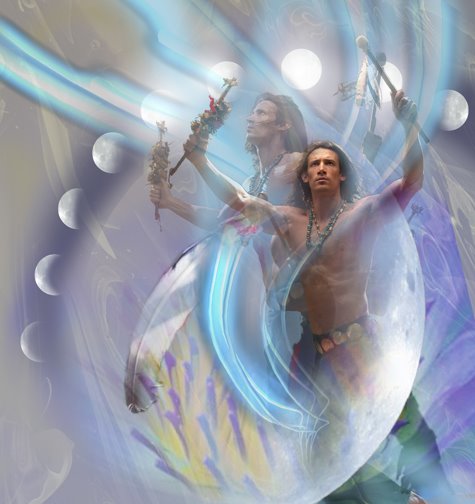
I created this image for Time Walker, another in the Time Twist series by Harlequin. All the books in this series deal with time travel in some form. I believe this was about an Native American from hundreds of years ago, who is a shaman and somehow managed to suspend himself in a time-less zone, to be discovered by the heroine. As with the other books, I knew only the barest elements of the story, just one or two, really. The rest I just made up. My apologies to the authors if I didn't adhere to their stories! I pictured the man doing a ritual dance that somehow performed the magic of time suspension. The model, Richard Myers, was able to get into the part, once in costume and camera shooting. He was excellent and went beyond what I was hoping for. I decided , after looking at the shots and not being able to pick just one favorite and seeing two or three shots together, to combine multiple shots in one image. This was really kind of a happy accident, but I had been experimenting with ways of depicting motion, so multiples had been tried before. I liked the way the several shots were a little cinematic and went along with the theme of moving through time.

Thursday, July 13, 2006

Legend Of the Christmas Stocking/Title Page


This is from my first fully illustrated childrens' book, titled The Legend Of The Christmas Stocking, published by Zondervan in 2005. I didn't write the book, but did all the illustrations. It is set in New York in 1815 and is a sweet morality tale about the spirit of giving. My favorite image from this book is this title page. I really got into showing a South Street seaport kind of place. I love History and doing this scene in a place I'm familiar with, set back in 1815 was a thrill! I took liberties with the place, of course, widening the street and making up storefronts and things in a romanticized version of what it might have been like. The boy in the foreground is the main character.
All the images were designed in Photoshop, Cararra, and Poser, and then painted in oil on canvas. I love the feel of paint and I have more control over color blending, but it's hard work. Plus, no "undo" button! I photographed a boy dressed in a costume for the front cover, but all the other pages had made up figures. On a few pages I found it helpful to use Poser to get the basic forms of the people and also play around with interesting viewpoints, but then I just drew & painted. It was quite a change from working with very photographic reference for clients who demand high realism, to trusting my hand and eye. It taught me a lot about trusting my abilities.
I used to work directly from my imagination and still do that in lots of areas on even realistic images, but for many years the emphasis has been on realism,- in the paperback industry at least.

Wednesday, July 12, 2006

The Proposition


This was an Inside Cover for a Harlequin Historical book of the same title. It seems there's a big following out there for Mounties! Dudley DoRight, notwithstanding, I guess women love that red uniform and the heroic reputation that comes along with the Mountie legend.
One of the challenges when designing these covers is allowing for all the type, logos and the accursed UPC code, which takes up a huge amount of illustration real estate! In this case the UPC code takes up the whole lower left of the image! But limitations have always been part of working for clients. I like to think that most artists in the past, ( up to maybe the late 19th century), as illustrators. They were hired to paint images to fit certain areas, tell a certain story, on and on. Sometimes the patron insisted on having his visage included in the action to be imortalized as a witness to some saint's matyrdom.
Things aren't usually that bad now, but we don't have the time they used to have to complete a picture. It's both a curse and a blessing. At least things can't drag on too long. the art has to go to the printer! The book has to go on the shelves!
The curse is that you seldom have enough time to refine all the elements as you'd like. It teaches you to see and think efficiently, to go for the essentials. What's the story? What's the setting? Action? Mood? And then to see it in you mind, the best way to convey all that.
In this illustration, I knew the couple had to travel a long way through the wilderness, the classic romantic theme of a couple being forced together, falling in love along the way. I concieved of this scene all at once, the warmth of the fire contrasting with the cool darkness outside their warm circle. Then it was a matter of getting the couple to be believable in this story. Fortunately, I was helped by having 2 terrific models, Nando and Suzanne Fogarty, plus a genuine (rented ) Mountie uniform and prairie dress costume. Warm gels were used on a very low angle light, cool gell on a second background light.