Wednesday, August 30, 2006

SEA GYPSY


This illustration was done recently for a Fern Micheals novel of the same name. I'm happy with the way it came out, I don't mind saying! It is a digitally painted image and I do mean painted. It was quite a challenge to get the girl looking natural on that boat and to have the water rippling out from her toe, but it was the labor of love. I enjoyed every minute of it! The model is Laura Williams, one of the best and most versatile models arround. She never fails to catch exactly the feeling I'm after and she does it with ease! The was no boat,( totally made up ), or water at the shoot. Laura was perched on a bench, with her legs draped over a sawhorse. More and more lately I'm finding art directors asking me to have the woman turne away, or somehow anonymous. The thinking is that she could be you, the reader,( in a perfect world!). I think they're right. But it's a bit of a shame not to see her lovely face!
Here's a link to Fern Micheals' site: http://www.fernmichaels.com/newsflash.html

Saturday, August 26, 2006

DIVINE PHOTO


Ok, In the interests of being informative and because PC Cast expressed an interest, I'm posting the photo used as reference in her cover, Divine By Choice. To recap the process a bit, I do a sketch, set up a shoot, pick the model, interpret the costume, ( in this case bringing in yards of gauze), specify the lighting, point of view and general pose. In the New York phot studio, the photographer, the costumer and me all run around like mad to achieve this result, wind blowing, fabric being wafted with lots of help, while the model, Maria, becomes the goddess, - all in one hour! In my studio I select the shot from about 90 frames and begin creating my illustration. It's not easy to describe how I do this. It is a bit like collage, mixed with painting, but also something else that the computer bring to it. I have to be mindful of the vision I have, no matter how focussed I get on the details. Back in the days of straight painting, we illustrators used different methods to help keep perspective, like looking at the painting in a mirror, or through a reducing glass, ( which makes the image very small), or even taking the painting outside, where it always looks tiny, pale and weak! But it's helpful to see the image with fresh eyes, to gauge whether it's getting the look we wanted. Nowdays on the computer, I can reduce the image on the screen, flop it, print it, whatever.
With this illustration I wanted to get across her divinity and her relation to the old tree, which I think is a portal to the other world. I wanted the tree to have a spirit, and envelop the girl, but also let her stand out in all her glory. I remember trying various electrical rays and lightning behind her, to show her magical power, but the art director wisely talked me out of it. The tree itself was inspired by several different ancient trees, one being a huge tree called the Angel Oak. It is really out of scale with her. She would have have to be very tiny in the picture or the tree would be just one massive wall of bark. So I just used some limbs from that, the trunk from another tree and the moss from yet another tree, which I then added to. I was trying for the whole scene to look like it was a sacred, ages-old place, and felt it needed a special stone, perhaps created by some long lost culture, to mark the spot. The stones were made in 3d, using Cararra with some wonderful, lichen textures I collected from somewhere and then given the embossed symbol and lots of chips, cracks, encroaching moss, etc. in photoshop. I sound very technical but it actually feels like painting.
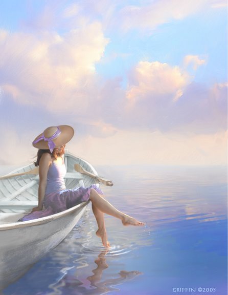
It is essential with figurative painting, to get the figure to "inhabit" the space. There are techniques, like making sure the perspectives agree, the lighting and shadows, but also the artist has to"feel" the figure's gravity intuitively. I envision a line of weight, running from the top of her head right down to the soles of her feet. When we stand, our weight is often carried more by one leg than the other. Paying attention to that leg helps visually anchor the person in the scene.

Friday, August 25, 2006

DIVINE BY CHOICE


This cover was done for the second book in the series by P.C.Cast, Luna Books, soon to be released. Maria, the same model from the first cover, portrays a heroine now at home with her divinity. She stands in front of an ancient tree, a portal into the other world where she is a goddess. This was done without having read the book, so I just imagined, based on a spare description, what the scene was like. There's a long-running dispute about how accurate the cover artist should be to the author's story. I've witnessed authors and editors holding up production because an item of clothing was the wrong color, but just as extreme, covers that don't have anything to do with the story inside! Some sort of happy medium is best, where the artist has license to interpret the scene and give it visual excitement, but also is reigned in a bit, so that the illustration really is about the story. The challenge for the artist is to find a way of summing up the scene in an image, without getting lost in slavish worrying about every detail.
It works best for me when I read the story and can visualize the characters, setting and action. I think there is usually a dramatic point in the story that might lend itself to imaging, but the spirit of the book has to be considered. Is it an action-packed adventure,or a thoughtful, poignant love story? These would require very different approaches! That love story might be best hinted at, with a subtle image, like a hand lifting a tea cup, or a beautiful scene that has a poetic connection to the book. The illustrator also should remember his or her image will help sell the book. So in that sense, accuracy to the story is less important than who is the intended reader. I've never liked this part of the creative process, because I think all sorts of people respond to good images. But there is a reality that can't be ignored! Readers picking up a book that has tough guys and explosions on the cover, would be upset to find a gentle story about a woman finding her true love, nor would the reader be happy who picks up a book showing laces, flowers and sunshine, only to find a book about monstrous flesh-eating aliens!
Why I don't like to pigeon-hole the intended reader too much, is because these conventions become stale very quickly. You can see this phenomenon in book stores, where all the books in a certain genre take on a look that is incredibly similar. They all are using the same symbols. Adirondack chairs are big right now. Check it out!

Sunday, August 13, 2006

A GRATEFUL HARVEST, Prairie River Series


This oil painting was done for the second book in the Prairie River series,by Kristianna Gregory. All four books of this series used the same central character and I used the same model as that lead character. Luckily, because these were spaced over a few years, the character in the book was maturing right along with my model, Kelly Lynch! From the first book to the last, she had tremendous ability in acting a role outside herself. She showed a lot of spirit, especialy in the first shoot as a 13 year old alone in a studio of adults, lght and camera pointed at her and the photographer and myself calling out directions.
I was after an heroic look to the scene, the young girl/school teacher toughing it out on the prairie. I wanted a sense of urgency, conveyed by the look on her face and the kid's poses, but also in almost every element in the picture.
I believe that everything in an illustration should support the story or feeling you're trying to convey. If it doesn't, it's a distraction.

Wednesday, August 02, 2006

Captive Dreams


This is a recent cover for Berkley and I'm afraid I don't know the author. I'll try to find out. Fantasy starring sexy alpha males came up in the discussion on Michele Hauf's Blog,(http://dustedbywhimsy.blogspot.com/). So here's my contribution to the genre. By the way, the dragon is supposed to look like it is made out of metal, like a broach, or something like that. I found it hard not to make it into a real, living creature. To do this image I had to train my eyes to see the guy the way a woman would. I asked myself, " What does a woman find sexy in a man? " All my experience indicates it's not the way he looks as much as the kind of person he is. Strong, decisive, but listens to his woman. He's independent, but devoted to her, and because he's magical, he can take her away from her mundane life! And of course he wants her body passionately! Is that about right? No wonder guys feel intimidated by the romantic ideal! Both sexes constantly do battle with the ideal and the real.
We might be strong, but we don't know how to listen, or we're good listeners, but can't whisk anyone anywhere! Do women read these books and then turn and look at their mates with dissapointment?