Friday, July 28, 2006

DIVINE BY MISTAKE


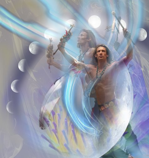
This digital painting was a cover illustration for the first of 2 books for Luna by P.C.Cast. The second is called, Divine By Choice. I enjoyed creating this image, even though tons of work went into it. Another opportunity for fantasy and a goddess! Most of the work went into creating the dias she stands on. It was made entirely in 3d. The horse heads were made in Poser and imported into Cararra, where they were flattened and attached to the steps previously made to form a frieze. The other motif used on the step fronts was made in tiny parts, assembled and stuck on the steps. The bronze incense burners were also created in Cararra. I applied and refined the stne and bronze textures in Cararra, too. The rendering from all this was brought into photoshop, where I added the background, running horses and grass. All this before the shoot. Actually, I made a girl figure to stand on the dias in Poser, to help the art director and photographer visualize thow it would look. On the day before the shoot I found an area of wild grass growing by the roadside and cut a large pile of it. My wife, Tabita gathered it into a tight bundle and braided some strands for a rope and we trimmed the bottom flat. I bought about 6 yards of flowing white cloth and lugged it all in to the studio for the shoot.
I had worked before with Maria, a tall, voluptuous Russian model, and she seemed right for this part. Sharon Spiak, costume designer, dressed her and Shirley Green, Photographer, set up lights and a platform to match my sketch and we were off!
The shoot was like a ballet, with various participants. I believe all the work plus my enthusiasm helped everyone get into the spitrit. This wasn't an ordinary, everyday shoot. We all knew we were creating art!
I don't want to forget another key ingredient in this process, the art director. I had the priviledge in this series of working with one of the best, Kathleen Oudit. It is not an exaggeration to say in many ways she was a co-artist on these two. We often work closely, inspiring each other with flashes of imagination. It is a rare pleasure to work with her !
As you can probably tell, I love my job. I often do way more work than necessary, going beyond what is called for, but I don't care! There is something about creating beauty, about giving a project your whole heart that is wonderfully fullfilling.
Very few people know what goes into making these images. Now you do!

Wednesday, July 26, 2006

F is For Freedom


I did this oil painting for the book, F Is For Freedom, by Roni Schotter in a re-publish by Scholastic. The story is about a young girl who discovers her home is part of the Underground Railroad, helping escaped slaves go North in the pre Civil War era. The two young models, who look just right in their mid-19th century costumes, were comparing notes after the shoot, talking about working in Italy for Vogue Bambini and Gap Kids, etc. Quite a contrast! I try to get the models interested in the drama of the story, how frightened they would be, the danger & excitement. I get totally caught up in the mini movie we're shooting. Of course, I do a lot of work post-shoot. For instance, one girl's expression is good in one shot, but the other's is better in another shot, involving lots of swapping of body parts. Many of changes go into the hair, costumes, colors and getting the figures to be 'in' the landscape. The painting is about 36 inches high.

Saturday, July 15, 2006

Time Walker


I created this image for Time Walker, another in the Time Twist series by Harlequin. All the books in this series deal with time travel in some form. I believe this was about an Native American from hundreds of years ago, who is a shaman and somehow managed to suspend himself in a time-less zone, to be discovered by the heroine. As with the other books, I knew only the barest elements of the story, just one or two, really. The rest I just made up. My apologies to the authors if I didn't adhere to their stories! I pictured the man doing a ritual dance that somehow performed the magic of time suspension. The model, Richard Myers, was able to get into the part, once in costume and camera shooting. He was excellent and went beyond what I was hoping for. I decided , after looking at the shots and not being able to pick just one favorite and seeing two or three shots together, to combine multiple shots in one image. This was really kind of a happy accident, but I had been experimenting with ways of depicting motion, so multiples had been tried before. I liked the way the several shots were a little cinematic and went along with the theme of moving through time.

Thursday, July 13, 2006

Legend Of the Christmas Stocking/Title Page


This is from my first fully illustrated childrens' book, titled The Legend Of The Christmas Stocking, published by Zondervan in 2005. I didn't write the book, but did all the illustrations. It is set in New York in 1815 and is a sweet morality tale about the spirit of giving. My favorite image from this book is this title page. I really got into showing a South Street seaport kind of place. I love History and doing this scene in a place I'm familiar with, set back in 1815 was a thrill! I took liberties with the place, of course, widening the street and making up storefronts and things in a romanticized version of what it might have been like. The boy in the foreground is the main character.
All the images were designed in Photoshop, Cararra, and Poser, and then painted in oil on canvas. I love the feel of paint and I have more control over color blending, but it's hard work. Plus, no "undo" button! I photographed a boy dressed in a costume for the front cover, but all the other pages had made up figures. On a few pages I found it helpful to use Poser to get the basic forms of the people and also play around with interesting viewpoints, but then I just drew & painted. It was quite a change from working with very photographic reference for clients who demand high realism, to trusting my hand and eye. It taught me a lot about trusting my abilities.
I used to work directly from my imagination and still do that in lots of areas on even realistic images, but for many years the emphasis has been on realism,- in the paperback industry at least.

Wednesday, July 12, 2006

The Proposition


This was an Inside Cover for a Harlequin Historical book of the same title. It seems there's a big following out there for Mounties! Dudley DoRight, notwithstanding, I guess women love that red uniform and the heroic reputation that comes along with the Mountie legend.
One of the challenges when designing these covers is allowing for all the type, logos and the accursed UPC code, which takes up a huge amount of illustration real estate! In this case the UPC code takes up the whole lower left of the image! But limitations have always been part of working for clients. I like to think that most artists in the past, ( up to maybe the late 19th century), as illustrators. They were hired to paint images to fit certain areas, tell a certain story, on and on. Sometimes the patron insisted on having his visage included in the action to be imortalized as a witness to some saint's matyrdom.
Things aren't usually that bad now, but we don't have the time they used to have to complete a picture. It's both a curse and a blessing. At least things can't drag on too long. the art has to go to the printer! The book has to go on the shelves!
The curse is that you seldom have enough time to refine all the elements as you'd like. It teaches you to see and think efficiently, to go for the essentials. What's the story? What's the setting? Action? Mood? And then to see it in you mind, the best way to convey all that.
In this illustration, I knew the couple had to travel a long way through the wilderness, the classic romantic theme of a couple being forced together, falling in love along the way. I concieved of this scene all at once, the warmth of the fire contrasting with the cool darkness outside their warm circle. Then it was a matter of getting the couple to be believable in this story. Fortunately, I was helped by having 2 terrific models, Nando and Suzanne Fogarty, plus a genuine (rented ) Mountie uniform and prairie dress costume. Warm gels were used on a very low angle light, cool gell on a second background light.

Monday, July 10, 2006

Morning Glory


I painted this illustration in oil back in 1989, for a book by the same title by author LaVerle Spencer. Quite a good book, actually, which they later made into a movie. I recently gave the original painting to my 80 year old parents and noticed the toolbox, saw, etc wasn't in the image! I remembered that the art director or editor at Ballantine books must have felt it cluttered things up too much! Oh well it's still there, it's under the grass I had to paint over it. There's a definite inspiration from Norman Rockwell in this one, I don't mind admitting. I didn't like adding the morning glories climbing up the right side of the image,it didn't look believable, but they wanted them to be visible at the edge of the front cover. They call that a " step-back " cover.
I brought my shaker rocker into the photo studio and had one of the most used Romance models of the time, P.J., now married with kids, bring her boys in to be in the shoot. Simon Rogers, British model, still in the biz, played the part of the out of work drifter in this depression-era story. At this time, we were shooting black and white film, so all skin tones and other colors were made up. I found an old, decrepit house on Mountain road, Dutchess County, NY, which became the inspiration for this house.

Sunday, July 09, 2006

Not Qite An Angel


This is an example of a hybrid art form that I've been involved with, neither strict painting or straight photography, but a fusion of both. It is a collaborative artform. The image is concieved of, a model is chosen, I bring in props, ( in this case yards of light, diaphinous cloth ), the photographer sets up light, wind and camera position as I want and then we see what'll happen! In this case I was working with one of my favorite models, Irina, (who is also featured in several of my Forces of Nature series). She is one of those rare models who seems to intuit what I'm after and express it with her movements. It's theater, dance, silent movies, all rolled into an hour of intense activity! I'm very glad to be working with photographers now, who use digital cameras, allowing the shots to be seen almost instantly. This is such a huge help over the way it was back in the dark days of film! Then we hoped and prayed that what we saw was what we'd get when the pictures were developed.
When I first started using photgraphs as reference in my paintinngs I tended to feel what I call, "Art Guilt ", which was a general sense that I was cheating by not painting from my imagination or life only. I couldn't resist photos, though and when I began doing illustrations, using them as reference became second nature. I don't feel Art Guilt much anymore, but am occaisionally reminded of the feeling when I meet an "Art Purist" . These people are seldom producers of mush art themselves, but frown, sneer and look down on any artform they see as impure. I suspect their very strict standards actually prevent them from creating most of the time.
Today I was reminded of Art Purity when I tried to list this Blog on a site that said, "No Photographs!" It started me thinking. Would they see this image, for instance, as a photograph? Probably. And yet, the shots didn't look like this before I started working with one of them, changing, painting, adding and subtracting. It's not really a painting, though, I will agree.

Friday, July 07, 2006

Seraphim


Seraphim, the first cover for Michelle Hauf's Changling series was done in 2003. I was thrilled to be working on this kind of project, a female fantasy/warrior/Joan of Arc type character, battlling the forces of evil! After so many years of Romance covers, I was trying to get the srt directors to see me in a different way. I felt I had so much more to offer in art. The realms of Fantasy and supernatural hadn't been tapped at all. I had tremendous fun with this one, both shooting it and doing the illustration. I chose an untried model, Topaz, who seemed to have the edgy look and slight boyishness I was after. The suit of armor, of course, didn't come in the female variety, but was nevertheless a good authentic looking costume, that took about 45 minutes to put on the model. Things seemed iffy, until we got he in front of the camera. That's when magic happened! That's also when my excitement about this image must have bee transferred to Topaz and Micheal Frost, the Potographer. Sometimes I can see that we have the cover in one shot, and that was the case here, but I got her to be even more edgy and powerful. It's method-acting really, and one of the most fun parts of my work. I would describe it as intuitively feeling what the model has inside. That fire, the fragility or confidence, whatever, and bringing it out. Working with the photos and my imagination later in my studio, I felt that something really special was being created. I've been a painter most of my life, but the collaborative storytelling and imagemaking is something quite unique to this business, I thnk.
A link to the author, Michelle Hauf's Blog: www.dustedbywhimsy.blogspot.com/
Please leave your comments!

Wednesday, July 05, 2006

Public Wife, Private Mistress


Working with art directors can be a lovely experience, or it can be hell! Sometimes we're just not in sync, they want the art to go one way and I see it in a different direction.This can lead to stiff, or uptight-looking images, but sometimes the challenge of doing something in a different way than you're inclined to do it can lead to suprising results. That's what happened in this piece. These books are always about a Greek, Italian or Spanish billionaire, who just happens upon an ordinary girl from Midwest, USA and falls for her. Hard. The art director wanted all the books in this line to be very photographic looking, which is a lot harder than it sounds. The photographs we take in the studio are not intended to be ready for the cover. For instance, at this shoot the couple wasn't in Sicily, but in a NY studio, on a table with a cloth over it. The girl was a brunette and a bit too large for the guy. There were no candles, etc. I decided on a high viewpoint, to be able to see past them and take in the shoreline. Because their relative sizes weren't a good match, I chose to put the guy in front with the girl behind, which allowed the guy to spread out a bit. I still reduced her later, but it seemed to work. Not only that, through a magical process of collaboration between the photographer, ( Shirley Green ), the models, ( Emrie, Jason Wright ), and myself, a really nice, sexy mood occurred. I'm offerening suggestions and commands, so is Shirley and the two models are doing what they can to be in the part. The whole thing, from putting on costumes, setting up the lighting & set and shooting maybe 75 pictures takes under an hour! When everyone's in the groove, it seems like a Major Motion Picture ! Anyway, I had my way two years after the job was finished. I simply re-worked it to be more painterly, the way I originally intended.

Tuesday, July 04, 2006

Sunshine Diner


This was done as "wrap" book cover, which means it goes from the front around the spine of the book to fill the back cover, too.
The image shows my admiration for one of the greatest Illustrators, Norman Rockwell. I grew up looking at his Post covers and wondering how anyone could paint like he did. Not just the technique, but the story-telling. I don't know where I saw a grimy old Diner like this, but it must be a compilation of many Greasy Spoons I've eated in and drunk bad coffee in. It may be part Rockwell, as well. The diner interior and exterior were made in Cararra, which is a 3d program. First I shot models at a table interacting. The photographer for this , Michael Frost, had some diner cups and other items and even the correct table and benches, making it somewhat easer for me in that they could be touching the cups. I then made the diner to fit them in Cararra.
In that program you can move he lighting around in your model and move the viewpoint, ( also called the camera in 3d programs), to view the scene from any angle you choose. I matched the angle that looked right for my photographed couple and rendered the scene. The rendering and photo were combined in Photoshop and I think the Sunshine Diner type and menus were done in Photoshop, too. I worked on this in Painter to give it a painterly look and back into PS to mix it all up. The last thing added was grime and a color layer to tone down the exterior, to help give it the feeling like you were outside at dusk, looking in.

Monday, July 03, 2006

Bewitching Familiar


This was another cover for the Time Twist series, published by harlequin. It was a blast, getting the models to act like they were being spun through time & space! I ended up having them sit, or lie on small stools while the photographer shot from above. I was trying to get them to imagine they were being pulled apart and had to hang on. Interesting lighting with a green gel helped Models: John Paul Feiffer and Desiree, ( never learned her last name). This is an example of an image that is a hybrid of photography and digital painting. In this series the art director wanted a photographic look. I think the result is something you couldn't do with just photography.

Prairie River


I did five covers for the Prairie River Series.This was my first 'young adult' series in a while and it was especially memorable because Scholastic wanted it done in traditional oils. The model, Kelley Lynch literally matured as the series progressed, Which was good, because so did the character in the book! In this cover, the first, the heroine arrives as an orphan trying to find her own life in a town way out west somewhere. I put her in the middle of the dusty street, looking a bit lost while the stage coach takes off in a cloud of dust. At the shoot I knew I wanted a twisitng motion in her body and that lost, but confident look and Kelly nailed it. It's one of my favorite parts of the job, bringing out something special in the models. When it's good, it's Art being created before your eyes! Somewhere inbetween silent movies and theater. More later on this series...

Man From Forever


Man From Forever was part of a 12 book series called "Time Twisters", all dealing with time travel. This one involved a Native American from the past, or something. I rarely get much info on these, and even more rarely remember the books after they're done. The series was fun to do covers for, in spite of a demanding art director. I could tell the models all enjoyed working on projects where they could play and use their imagination. I did, too. after so many Romance covers, Sci-Fi and fantasy is a treat!

Sunday, July 02, 2006

THE DOVE


This digital painting was originaly much brighter in mood, but I reworked it after Bush/Cheney/Rumsfeld invaded Iraq. The girl, of course, represents peace or the yearning for peace. Her dress and shawl grade to blood red at the bottom as a way of using color to express emotion, the emotion in this case being despair about the needless horror and killing, which I felt would only stir up even more bloodshed. I doubt if we have ever had such wrong-headed leaders running the US. Their idea of working things out is to shoot first, ask questions later. Or never!

Please leave your comments!

Saturday, July 01, 2006

Gossamyr

I created this illustration for a book by Michele Hauf. Gossamyr is the second in the series, the first being Seraphim. Rhianna was the third book in the group . They're all about powerful women/warriors/fairies/godesses that inhabit another world. I enjoy creating these powerful women for a combination of reasons. The concept of beautiful, feminine creatures having vast powers is just intriguing and sort of sexy to me. There's also the feminine principle, which is that men carry in them the ideal female, the oposite, but also part of their masculine self. So in these powerpuff girls I'm also bringing for to the female side of me. But mostly it's just fun to get the models dressed up in these fantasy costumes and act out these powerful roles!
Photographer: Shirley Green. Model: Hillary. Costume: Sharon Spiak. Styling: Nevio Razzagani
Link to Author, Michelle Hauf's Blog: www.dustedbywhimsy.blogspot.com/

Gossamyr/ For book of same title


Please leave your comments!