Thursday, September 28, 2006

THE QUEST


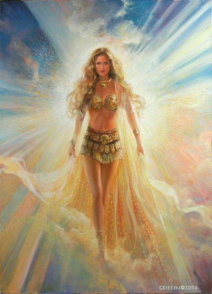
This image wasn't done for a book, but was one of those things I do for pleasure, when I "cut loose". It's just fun to try new ideas out that nobody has to see, - unless it turns out well! And believe me, there a plenty on the cutting room floor, as they say in the movie biz. So I guess I like how this came out. It really started with a face from a shoot I did several years ago. I was having Irina twirl in the wind, wearing dress, a long cloak and a sword! She was playing with different expressions of fierceness and something about this frame struck me as intense and beautiful.
I added lots of hair and started playing with the background, which was a swirly fantasy scape. It didn't work. It got put in a folder,where it sat for maybe three years till I retrieved it. This time I had a better idea of where I wanted it to go, perhaps as a result of something I'd figured out in that time.
That is one of the interesting things about working creatively, ideas evolve. Often an idea is hatched, but the knowledge or experience isn't ther to make it work. The artist, Charles Burchfield went bask to little sketches he'd done 20-30 year earlier and glued them down in the middle of large watecolor paper and just elaborated on the images outside of the small original rectangle. He did some of his best paintings like that. Anyone who is not familiar with his work should have a look.He was a truly unique painter and viataly in touch with nature and with expressing emotion. He also managed to convey sounds in his paintings!
Wow, that was a tangent! All I was trying to say was to hang on to those ideas you have an maybe later you'll know what to do with them!

Friday, September 22, 2006

THE PRICE OF MURDER


Here's another mystery cover, done for a Berkley book of the same title by Bruce Alexander. It is the last of his Sir John Fielding Mysteries, sadly the author has died. I was asked to create an image that looked like a period painting, but gets across the mood and hints at the story. The series is set in Regency times, but involves a young investigator who works for and is the 'eyes' for the blind Sir John. There's a nice mix of views of the better side of London society and the really seamy underbelly of dark streets, danger and shady characters. The story begins with the discovery of a murdered child and that's the scene I was asked to do.
I started by doing a lot of research into early photos of London, but they don't really exist from this early on. Photography really started to be a real device for recording scenes in the 1840s, while this story is set around 1815. there were later pictures of the Thames area, but by then the character had changed quite a bit, so I extrapolated from photos taken a little north of london back in the 1870s which showed smaller buildings and a little more humble waterfront. To these I added a faint St. Paul's on the opposite shore, and populated it with figures and a cart. The figures were all made up, using reference of workers and fishmongers in old photos, with one especially important figure, the fishmonger on the right sadly carrying the bundle containing the dead child.
It's an incredibly gloomy scene! You can almost smell the coal smog. I was worried that the art dierctor would hate it, saying it was too dark and to lighten thisngs up, give it a blue sky,etc. Surprisingly, they went for it, maybe because it conveyed the mood of the story.
I used the horsecart, the most foreground object in the scene, to draw the eye in and then over the diagonal line of the road to the man and his bundle. So, rather than just see a gloomy old painting, the mind is curious. Just what is going on here?

Monday, September 18, 2006

IN THESE DARK HALLS


This one goes way back, to 1986, two years after my Italy trip. I think it is heavily influenced by Carravaggio. I don't remember the real title for this book, but I was doing a bunch of covers for the well known mystery author, Mary Stewart, so it could have been one of hers.
I love doing mysteries, especially when I can get into the pychological state of mind of the protagonist. In this case a young woman in hard times is married to a rich but disturbed Lord who takes her off to meet the folks, a difunctional family unit, if there ever was one! Just when she is getting used to the icy dislike of the in laws, she begins to think her new husband might be trying to kill her! She is snooping around at night, in my picture, trying to find clues, when she hears someone else skulking around,-maybe her murderous husband? I chose to bring the girl right up front so we can see her expression, while she is turning and directing our look to the shadow of an offstage person at the bottom right. It is much more frightening sometimes to just hint at the "monster in the house" than to actually show him.
The Carravaggio influence is in the strong light and shadow on the girl and the contrast between her and the dark background. In an illustration you have to grab the attention of the viewer and make the important action in the story you're telling very clear. Every element in the picture should help direct the eye to that message. But art works best when there is more to it than just the obvious message. We want to read into the image and in this case, the eye keeps coming back to the girl whose expression is somewhat ambiguous. Is she frightened? Determined? Curious? What does her hand express? These are the stories under the Story and help give the image interest.

Tuesday, September 05, 2006

THE SUN


THE SUN, from Forces Of Nature series. This is the latest image in the group, in fact the paint is still wet! This series is not for any book, but is part of an ongoing set of allegorical images I'm doing, using female figures to embody the forces of nature. This is the second attempt at The Sun, the first just didn't feel right. I found the sun to be a very challenging subject, perhaps because it is so important. The painting went through months of changes, sometimes looking to harsh or too warm or too religious, like those paintings in Mexican churches of the Virgin Mary. That wasn't what I wanted. Instead I envisioned a woman, young and powerful, radiant with energy and even sexuality. Yet there is a spiritual quality about the sun, too and I hope I conveyed some of that in this piece.
I set up problems for myself from the start with the lighting. Where was the light coming from? Behind her? To the side? From inside? Each question goes to the essence of what she is and I never really decided, so the light comes from behind her, as if she was bringing it to us, but also from the sides, as if it were wrapping around, in order to keep her from being just a silhouette.
Departing from my usual practice, I didn't use a model, but instead created a woman in Poser. I wasn't happy with the poser girl's face, so I borrowed a face from an earlier shoot, but changed it drastically, adding yards of golden hair and her gold accessories. Her gesture kept troubling me. Was she aggressive, like a warrior? Her gait and body posture sure looked that way.
I tried adding a spear or something to her hand, but it seemed distracting and too warlike. I don't think of the sun that way. In fact, I don't think of the sun in only one way, it is so important, so vast and life-giving, but can also kill with it's heat and intensity. I think this won't be the last version I do of The Sun. Wait 'till you see my rendition of The Moon, as a contrast! It's in the works now.
It's important to note the difficulties and the failures when talking about the process of art. Museums rarely show artists' failures, and they don't show up in books much, but believe me, they exist! The creative process is hard, messy and generally a fight between discouragement and perserverance. A typical project for me starts out with the excitement of potential. This could look cool, or maybe like that! It's all possible. Then my limitations begin to show. I get depressed. "What a lousy artist!", goes the voice in my head. Sometime, often, that voice wins and the image never gets finished, particularly in my personal work.
In Illustration, of course we don't have that luxury.We have to come up with something at least acceptable, if not better! What pressure! But this is also one of the great things about the job. We aren't allowed to give up, so somehow we find a way to get beyond the discouragement and then something begins to work.
My Grandpa told me back when I was just a kid, that the true test of whether a profession is a good choice for you is how much you love of it's drudgery! So much of what goes in to any work of art is like that. Just menial, hard work. Drudgery. But somehow it can be therapeutic, just to clean the brushes, or arrange the computer files. Inspiration comes along to those already working.